Buxom: Design & Typography

BUXOM
Buxom Cosmetics is the cheeky younger sister of bareMinerals. The Buxom brand voice is bold and provocative; Buxom is all about owning sexy. Buxom exists to bring out the confident, daring, sexy temptress inside every woman. The products are a full-sensory experience, with rich, touchable, lush textures and vibrant colours.

BUXIQUETTES
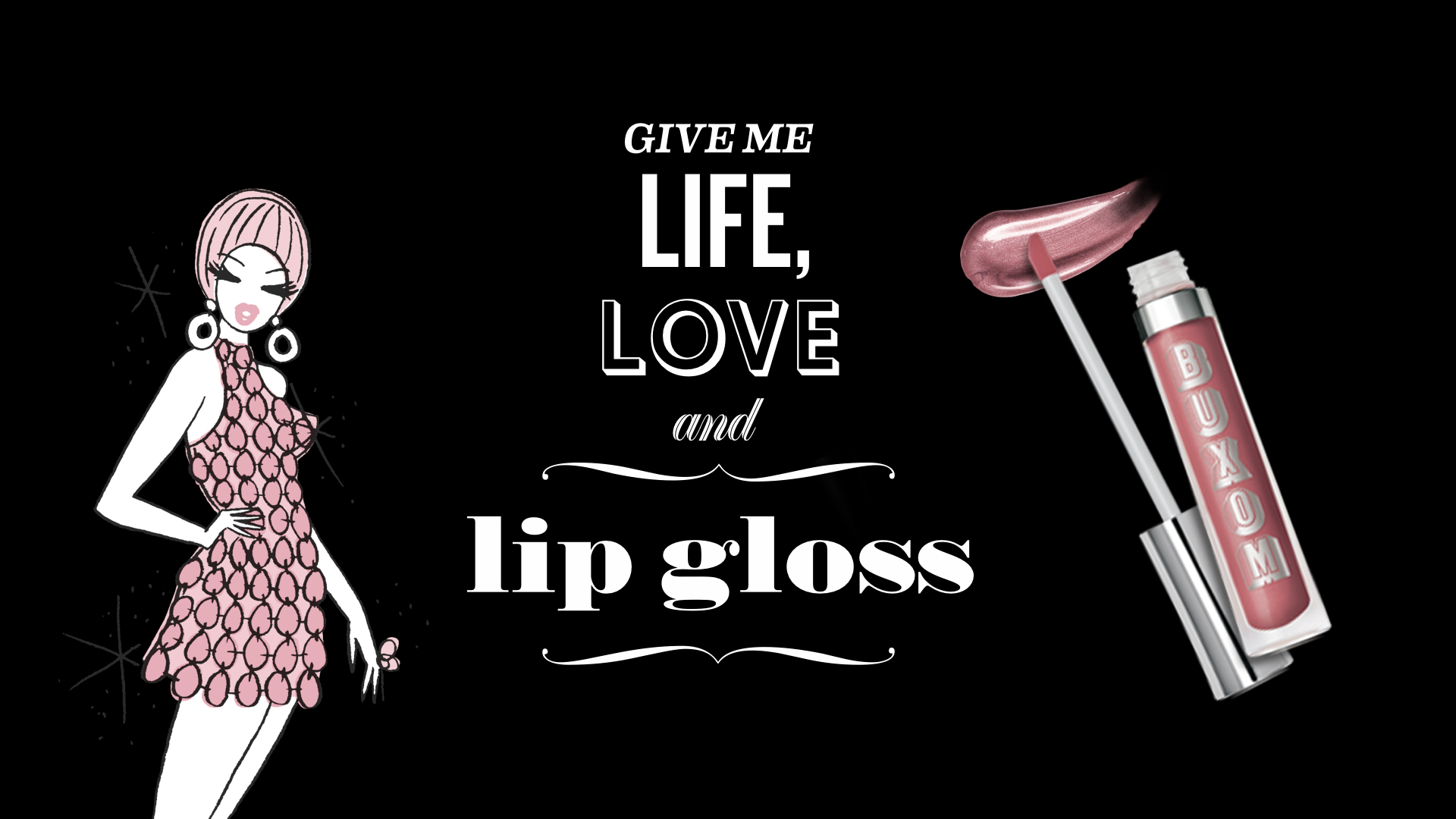
The Buxom babes have been around the block; I brought to life some of her "buxiquettes" for an ongoing series that began on social media. I combined brand typefaces, ornament and icons to create a system that has energy and variety, but maintains a clean and simple hierarchy.


KALEIDOCOLOR SEPHORA PITCH
A full brand immersion for Sephora, the main distributor for Buxom. We envisioned a sensory experience centred around a kaleidscope animation of vivid, bright, deeply saturated lipglosses. We extended the theme to an iPhone app, email and landing page.


