Milk-Bone: Art Direction

OUR BRIEF
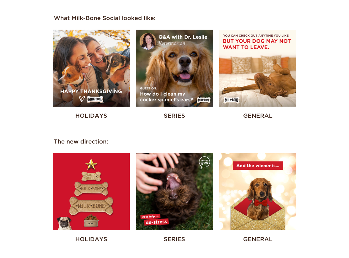
Milk-Bone wanted to invigorate their social media creative and appeal to a younger, more media-savvy consumer. Their social media posts images relied heavily on stock photography and lacked the bright, fun Milk-Bone identity.
THE SOLUTION
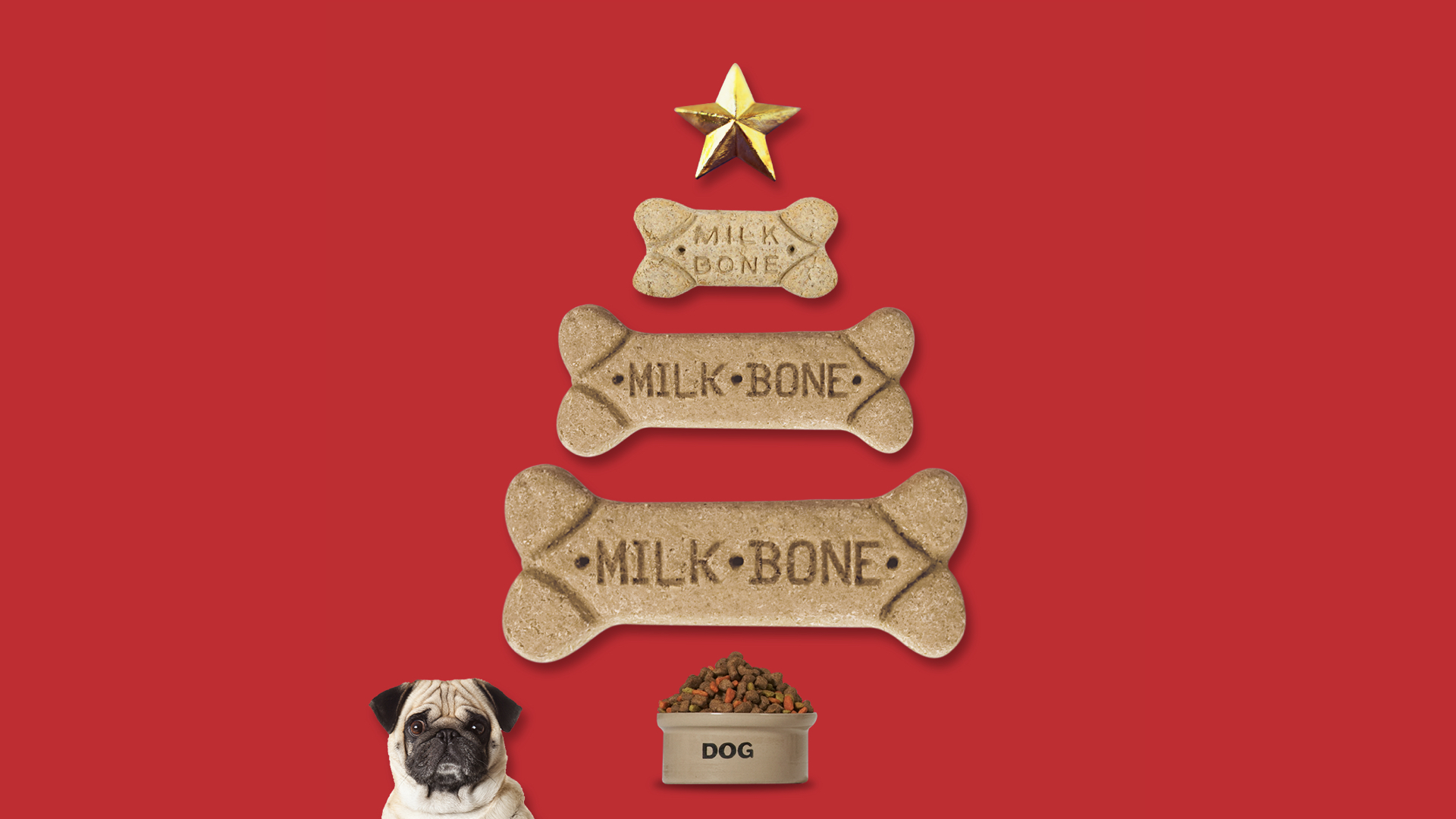
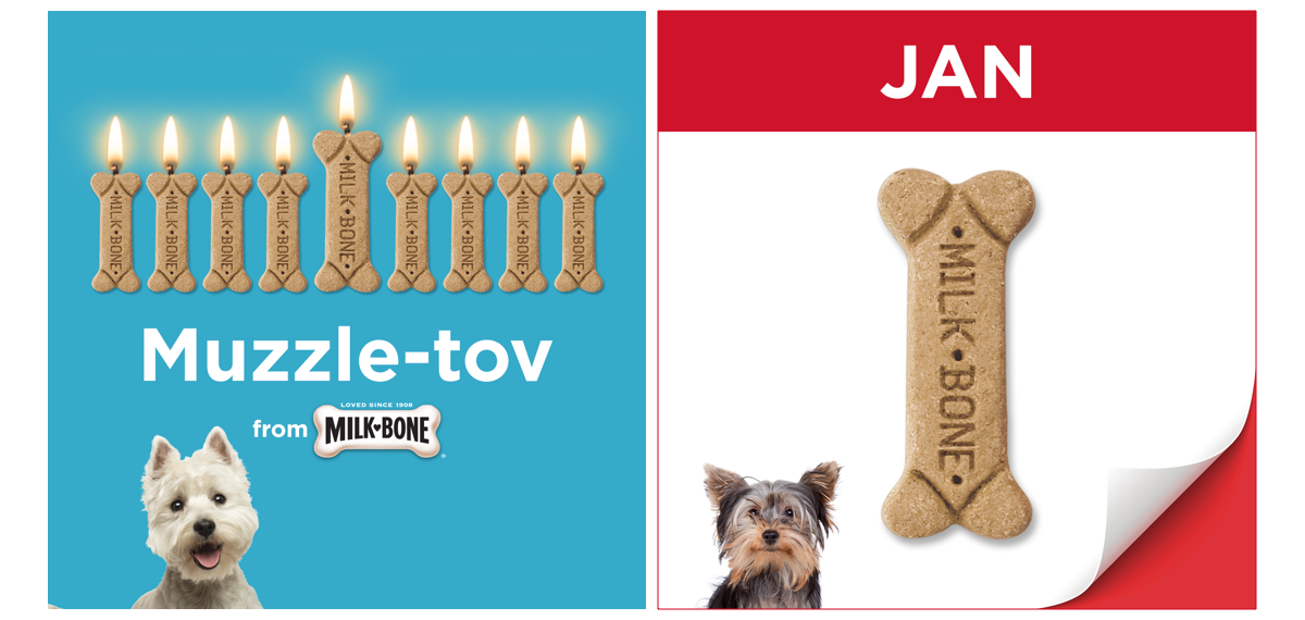
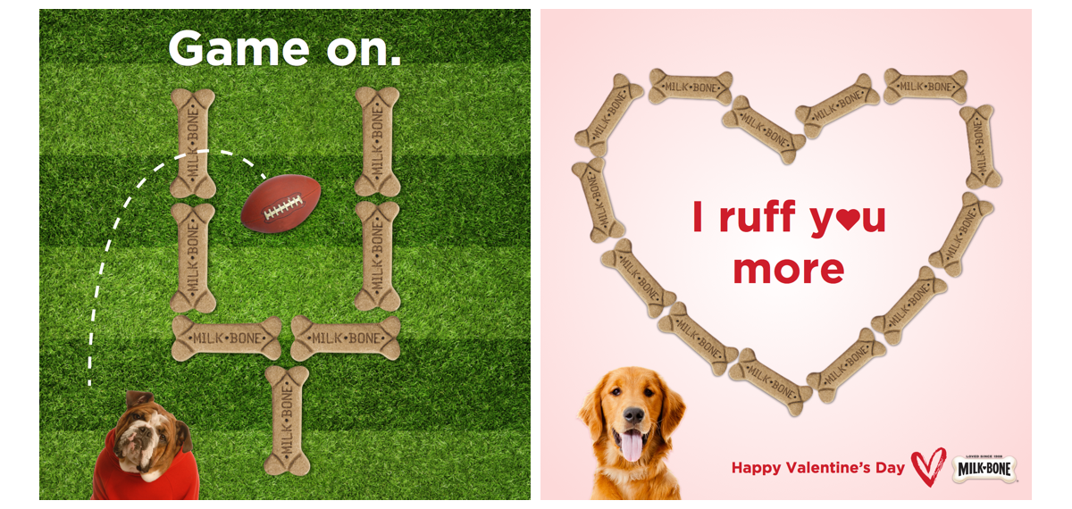
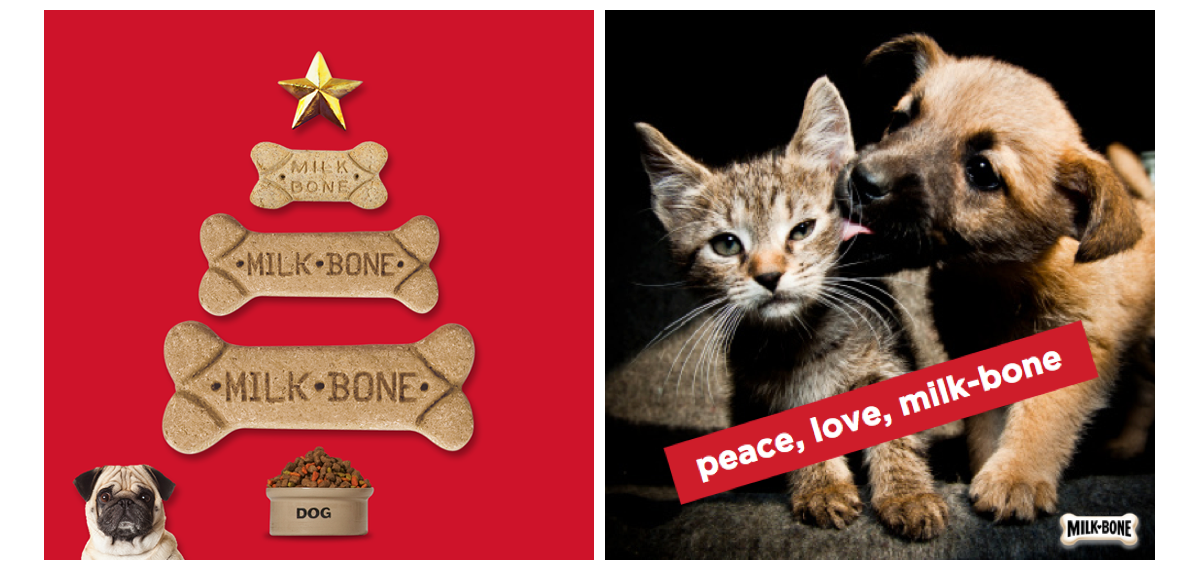
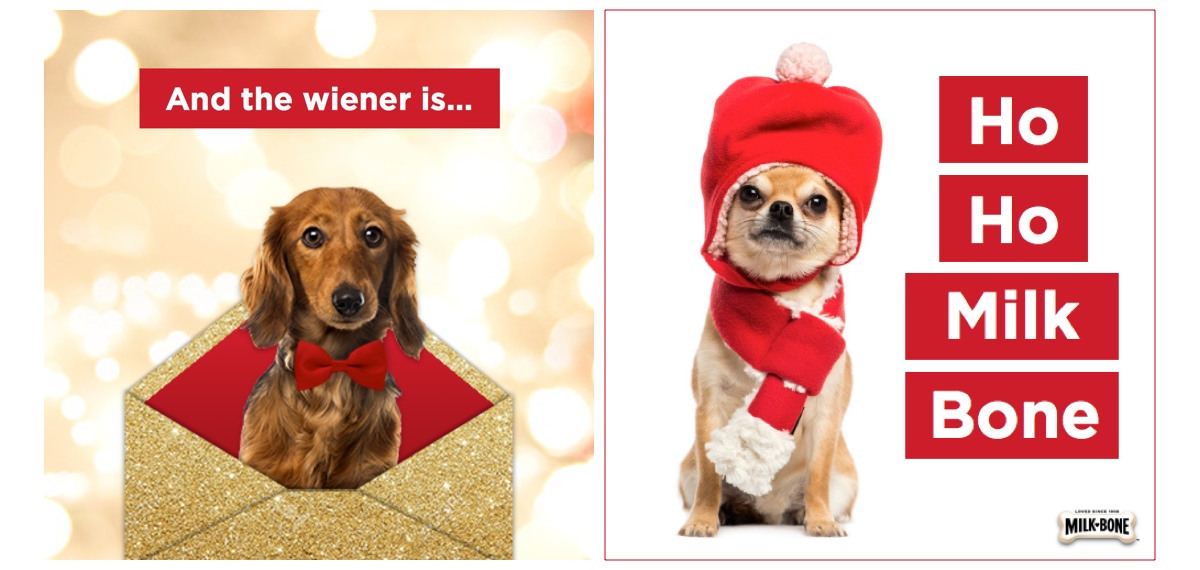
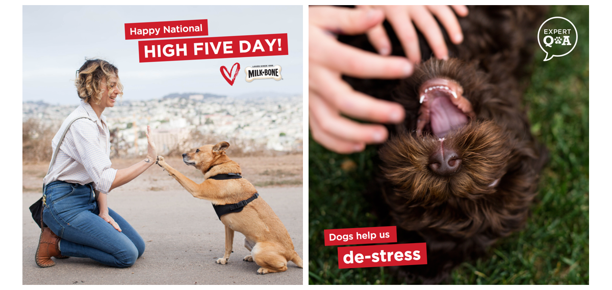
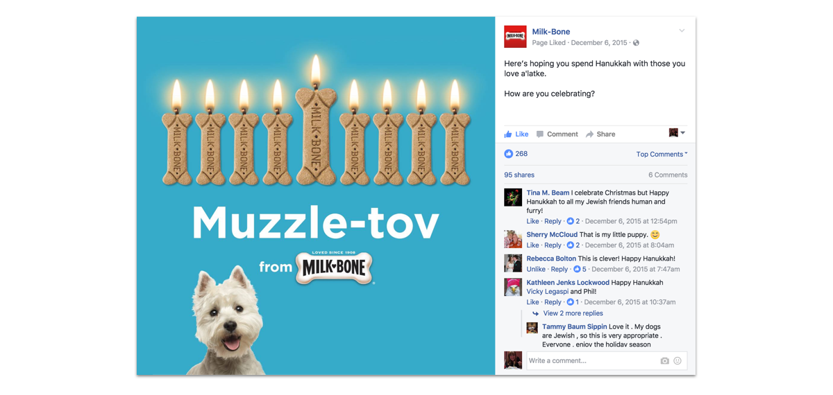
Of the ideas I developed, they liked using the Milk-Bone dog biscuit and the red bar treatment the best. The iconic Milk-Bone biscuits can illustrate recognizable elements like menoras for Hanukkah, love hearts for Valentines etc, and also for everyday posts - a trail of biscuits for Take a Hike Day for example. The solid red bar behind the type is the key design element, it’s bold and confident and makes the text pop.
RESULTS
The new direction proved a hit. The Hanukkah post received 268 likes and 95 shares (the average post has 65 likes).
